
The ELCA has a brand new look.
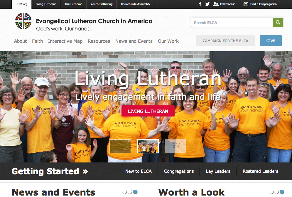
I haven’t dug enough into the new site to give a complete review but, at first glance, I like what I see. The website is fully responsive and seems designed from the smartphone, out. This is brilliant. The front page feels great on a smartphone, easy to navigate, intuitive, and the menu works perfectly (its large size is perfect for fat thumb syndrome and synchs well with other menus that look like it). This mobile site blows my most recent attempt at responsive design out of the water and, for that, I’m grateful. Well done!
Of course, the website itself is still too heavy. There is too much information on it and it is trying to do too much. This has been a problem for elca.org forever. The website is seen as a one-stop-shop for all denominational and visitor needs. I doubt any non-ELCA Lutheran will look at that site and be encouraged to dig deep within it. The desktop experience just is too bloated to cater to the brand new visitor. There are too many menus, too many sliding pictures, too many places to click, and too many different page templates. The interior pages, surprisingly, are not terrible but their experience on the big screen is lacking. The content in the center is not the focus of the experience. On a small screen (or smartphone), that center content would really pop. But, on a big screen, it is trapped by content around it. And the deeper you get into the site, the less intuitive the menu choices become. It is easy to get lost in the site and not know why that happened. There’s just too much here – and just not enough of the right stuff.
All in all, this isn’t a bad attempt but I’ll hold off on my final judgement until I see how the new call process/assignment/clergy-paper-work section looks after December 9. As an almost-clergy person (God willing), these new web-forms are what I’m really looking forward to seeing and exploring.